Welcome to the Question2Answer Q&A. There's also a demo if you just want to try it out.
+13 votes
5.4k views
in Themes by
edited by

I would like to hear from you all what you want to see in next version of Snow Theme. I am planning to start development from end of Jan or February first week. There is no deadline defined yet.

Some features from myside

  • I am going to write theme from groud level using Compass and Sass framework.
  • The very obvious feature I am going to add is Responsive Layout ( I know you all will love that :) )
  • Keeping existing look will make make it more elegant

Please post your thought and feature request for the theme. I am not giving any promise but wll try to implement as much as possible.

This call will be closed by Jan  Feb 14, 2014

Note: By mistake I have added Jan instead of Feb (funny mistake sorry about that)


What will be new in Snow Theme 1.4

  • Responsive Design
  • New modern look with slick and minimal design
  • New design for Users page and User profile
  • New design for tags page and probably category page
  • Built in social share option
  • More useful feature
  • Top bar with multiple choice (dark, light, sticky  etc)
  • Probably some color setting options
  • Left or right sidebar selection

Will update the list if add more feature

by
Forgive my absolute ignorance in this subject but if you will be working on 1.4 and in the standard Q2A installation I see 1.2 then I must have missed 1.3 :) Where can I download that version? I have a few comments about 1.2 but need to see if they are present in 1.3 too in order not to make lose time. Also, in case I find any issue/bug where should I report them?
by
Fist, you haven't missed 1.3 but (according to my knowledge) it will be released when Gideon will release next version of Q2A.

You can send me your comment for 1.2 in PM and I will see if it is exists or resolved. If not than will take it into consideration for 1.4
by
Maybe it's more clear when can we expect theme release ? Thanks :)
by
No released date has been finalized yet but probably will be able to say once I finished all pre-work by end of this month or first week of March.

9 Answers

+1 vote
by
1. Option to let users change the background image / texture / color

2. +1 for Responsive template
by
Good Idea...
+2 votes
by
edited by

Thanks for the comment. I noticed you're fixing the not fixed avatar image. I also found this issue (under Chrome):

  1. Create a one line question and a one line answer.
  2. Mark the answer as selected.
  3. Click on the edit question button.
  4. Scroll down to the answer and you should see the selected answer check cut.

​Possible fix: Just taking a quick look with the inspector makes me think the correction should be adding a min-height: 120px to the .qa-a-list-item-selected class but that is just a guess.

I had another improvement to make, which I thought it should be fixed in the the theme but after taking a look at the core I noticed it would be better to change it there. Pull request here. Hopefully, gid will bite :P

I'm also not sure how much you've changed this but I performed some changes to the style of the user ranking by adding height: 30px to  .qa-top-users-label. This helps the rows have the same height.

Also when using plugins that add columns, space is considerably reduced so using smaller horizontal paddings would help avoid wrapping usernames. Current cell padding is 12px for left and right and 6px seem to be more than enough.

An additional change I made to the style is adding space between the cells in the tags ranking. I'm not necessarily saying this should be added, it is just a change that satisfies me :) This means adding border-collapse: separate; border-spacing: 10px to  .qa-top-tags-table.

There is also an issue with the native notifications qa_db_usernotice_create($userId, 'This is a test'). Fire a couple of them at the same time. They get properly stacked. Close the first one from top to bottom. It seems the page title is pushing up and cutting the notification in half during the duration of the animation:

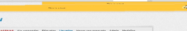
It seems this gets fixed by removingdisplay: block from .qa-header.

Now, an improvement that, IMO, is a must do is properly handling voting delays. Right now, you click on the up/down voting arrows, and everything freezes until the ajax request is finished. So you don't really know if you hava actually fired the ajax request or not until it finishes. I see a few options here:

  1. Disable voting arrows once the ajax request has started
  2. Add some kind of loading image to let the user know the page has started handling the vote
  3. Given the fact that 99% of the times the AJAX request will succeed it seems fair to handle the vote first in the UI and then by peforming the actual AJAX request. This means, firstly, updating counters locally and then firing the ajax request. If the AJAX request happens to fail roll back the vote. This strategy is used by Stack Overflow

Another thing I like is having the ability to show/hide the vote details. Assuming Q2A has been configured to display both upvotes and downvotes then I like the way stack overflow handles that. They show the total score of the question and if you click on it then you see the details:

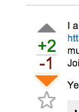
Having the votes span up and down saves space. Same happens with the star in that "vote" column.

Another thing that would be handy would be to have the title of the question as a link to itself in order to easily perform page refreshes.


by
Okay I will consider your points during the update.

Designing is a very choice specific so I have to consider generic look which can fits all basic need and functionalities. Like colors, extra padding etc. However for the v1.4 I will try to make it more clean and responsive.
by
Regarding the voting delays, this may not be doable in the theme, it would need to be in core. And it would be difficult to do your last option because when you vote, the AJAX request returns the replacement HTML, so you can't change it until the request has completed.
+1 vote
by
In my case the most important thing that I would like to have using q2a  is a fully functional user interface on the mobile devices (handset and tablets, mainly Android and iOS).
As an example, I've found very light, functional, quick and easy to use the stackoverflow UI, navigating through the posts but also on *editing*, posting and voting.
I've highlighted the word "editing" since I have some doubts that using the CKEditor on a mobile UI (as I've seen in other responsive UI) is the right choiche. Too tricky to use  and *not* user friendly in my opinion on a "small" mobile device  (assumed that it works perfectly everywhere) . In my opinion the editor must be simple and easy to use (again : see the stackoverflow choice).
That's just my 2 cents.
by
Thanks maxjtechno for your feedback,

I am too thinking to make navigation as simple as possible and I agree with stack overflow user profile but since many of those item is require updates in core. So need to see how much I can do within the theme.

For the editor, as per my knowledge Q2A use simple text area for mobile and doesn't add CK Editor which I believe is perfect for those devices. The most frustrating part on mobile editor is selecting specific texts.

The look and accessibility I will try to make it more simple as that. Especially for small devices.
+2 votes
by
edited by

That's great news! Here's some of my suggestions:

  1. Different colors for viewed questions. A question should not be considered viewed if it has new comments or answers.
  2. Set a unique class for userlink at navigation bar. That's useful for people who set a dark background there.
  3. A prettier design for the Register button. It could be the same as Login but different color.
  4. Fix layout breaking in mobile devices. Example.
  5. Dropdown menu when mouse is over links with sublinks.
  6. A design for user points at navigation bar.

In no specific order.

by
Thanks for providing your input in this.

Point 1: I may add link:visited property
Point 2: Can you please explain it more. Since don't understand which navigation bar. Is it main nav or user nav?
Point 3: I see.. how about green color and little bit larger than normal size?
Point 4: I will see and fix if possible
Point 5: This may require update in core but will see.
Point 6: What type of design for points. Do you have any suggestion or reference to see.
by
1. I meant something related to specific user data. In any device I login I'll be able to tell which questions are new to me. This data is currently tracked by badges plugin but it might be not possible to identify if a user didn't reopen an updated question.
2. User navigation. "#qa-login-group".
3. Green is perfect! I'm not sure if a larger size is necessary though. I think it's better if it has the same height as Login button.
4. =)
5. =)
6. Instead of the parenthesis, the userpoints in usernav should have it's own class. A block link such as the one used for tags is interesting but it needs to be minimalist in the usernav. An example is a white background with round corners for darker usernav backgrounds. It could also use golden colors to remind of achievements. Also, it could link to a page explaining how to earn points or the userpage. I updated my answer with a couple of examples.
+2 votes
by

qa-nav-user is to short (width:500px; fixes it), search button seems not in place. If its matter if you rewrite all theme...

Generally i think theme should look more clean (less bold fonts maybe...)

I may update my thoughts.

Looking forward for new snow, thanks :) !

by
For qa-nav-user I just wonder why it is that... But anyway I am planning some better option for that so lets see.. Added point to the list.
0 votes
by

I post here also this FB login layout issue...

http://www.question2answer.org/qa/30511/facebook-login-bug-logged-into-different-profile-than-main


on the thread there were some more comments, I think that they have been lost in the 23 January server crash sad

To reproduce it :

1) login on your FB account (where you have 1 profile + 1 page)

2) "use Facebook as" your page

3) navigate to q2a (where you had not logged in yet, previously)

---> the blank square appears (and disappears after 45 seconds)

I think that modifying the css the blank square could be avoided....

by
This I need to check. I amnnot so sure but probably need to fix in fb plugin itself. Still considering as theme bug.
0 votes
by

Its great that you are recustomising the snow theme. 

If you can add then many would like to see

  1. Better social sharing options and widgets.
  2. Improved and elongated footer so that we can add some widgets in there.
  3. Some widget in relation to highest scorer or user with max best answers or most active members. 
  4. If you can provide then we would like to have some more colour options in this theme. 
  5. Now a days, sticky menus are liked the most, if this feature can be added then this theme would directly become the best. 
  6. And last, if all this could also be done in a responsive manner so that there should not be any problem while displaying all this in mobiles.

I don't know whether this all can be done but if you can do all this, then there is no need for any other theme. 


0 votes
by
Will be great if you add a fonction to show a similar or random list questions by ( tags, categories), below the answers.
0 votes
by
When is the release Date of Responsive Snow?
by
There is not such deadline defined as I am full of work load. Still will try to finish it by the end of may or so.

My idea is to make theme with the current design trend and can fits with majority of the requirements.

So Q2A will have great look out of the box as per the current design trend.
by
Thank you Soni, we all appreciate your work
by
you are most welcome... Thanks to everyone for appreciation.. I enjoy working for community :)
...