Welcome to the Question2Answer Q&A. There's also a demo if you just want to try it out.
+3 votes
2.9k views
in Q2A Core by

I already stated that the font family Ubuntu is not suitable and sans-serif should be used, which was discussed without conclusion, imo. 

I want also to point out that I am rarely visiting the official forum anymore, because I cannot stand the recent colors and elements of the theme. No, the theme is great but it needs to be simplified in 1. colors and 2. elements.

That is a recent screenshot with attention areas:

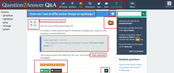
Don't you see that it is too many colors?

Already the box on the bottom: answer button green, comment button darkblue, tags orange. In one spot?!

Also the question2answer banner is too huge. And it does not suit the theme... just write it as text and make it small. 

Furthermore the question list is way too colorful:

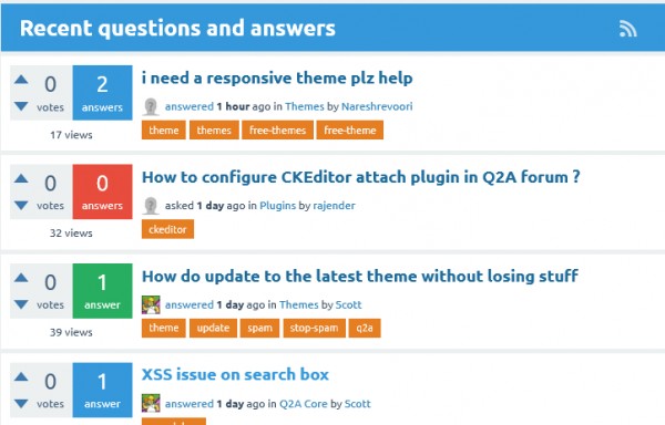
blue red green orange next to each other, 4 colors? I know that somone wants to express "best answer given" or "no answers" or so, but honestly, I just care about the question title and maybe look at the answer count. The votes are also not important imo, at least not in the question list.

Well, I suggest to get a designer. Or always have "simplify" in mind, keep it simple. The Snow theme was simple enough.

Just my two cents.
Kai

Q2A version: 1.7.1
by
+1 Totally agree...
by
Just to add to my answer, if the font on this site is really preventing you from coming here then take a look at the Stylish browser plugin.

You can add your own CSS to any site and override the font and colours if you like.

2 Answers

+1 vote
by
edited by

For some part you are right like too big logo, different coloured "Ask a Question" button.
And I also agree that too many colours have been used in the website. At least the Question page should be more minimalistic so that complete focus can be on content rather than funky stuff.
But on the other hand, the colored homepage is actually what's most interacting for users on my website. It acts as a eye catching stuff for users, so I do not complaint about the homepage at all.

The real problem which I see is the header, Q2A is used for community websites and this header is just not right for community websites. If we see to most famous community websites like Facebook, Twitter and Quora then they all have some similarities, that they all have centered search bar, user sign in/ sign out, user avatar in top bar.
Menu is put in sidebar so that it can be extended as long as we want without destroying the UI.

Update

0 votes
by
Thanks for voicing your concerns.

Firstly, several of the issues you mentioned are not specific to the theme. The logo is the same size it always was in the Snow theme. And the votes are a core part of Q2A, it allows you to see instantly which questions in the list are considered good.

Half the stuff you circled in your image is not the theme. You can't blame users' avatars for adding too many colours to the theme. The code text you circled (last line of the question) is also not the theme, that's come from someone copy-pasting the code from elsewhere and the CKeditor keeps the formatting.

The theme is meant to be bright and colourful. The "ask a question" link is purposely a different colour to make it stand out. The colours on the vote/answer count boxes are the same as the Snow theme (actually Snow has 5 colours and SnowFlat 4).

I can see your point about the tags, they probably don't need to stand out as much so maybe we can go back to grey.

I also agree with Gurjyot about the header/menu. While I like the idea of the big buttons and icons, in practice they don't really fit in the space. Perhaps we should go back to a similar layout like Snow/Classic for the header - logo on the left, user stuff on the right, with the menu on the next line either with no icons or small icons to the left of each menu item.
by
Yes old snow but responsive version solves all these problems.... :)
by
I agree with what you said. Remove the icons with menu because when we add some custom pages then also there is no way to add custom icons.
But do not shift logo below top bar, instead if we are removing menu from topbar then its perfect to have logo in top bar just like in Discourse and Flarum. This is also good to place a full sized banner ad below top bar.

So in top bar you can have, logo then search bar then notifications icon (which will be implemented in 1.8) then user avatar.
Below that there can be menu.
by
I have also added a good example of header which can be taken as a reference for the new header. The top bar length is perfect and user avatar size is also good enough. Although, search bar and notification icons can be interchanged but that is on what the community would like.
...