Just adding another random tip explained for non-developers. If you are using Snow theme in a non-english language you might have noticed that the admin menu bar gets too long and it gets cut not in 2 but rather in 3 lines. This is an example of what it looks for the spanish translation:
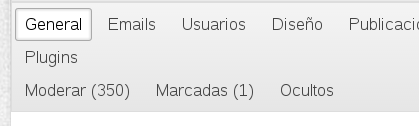
The 1st and 2nd lines make sense, while the 3rd doesn't. In order to merge it with the 2nd you will have to:
1. Locate file qa-theme/Snow/qa-styles.css
2. Find this piece of text and remove it:
.qa-nav-sub-admin-moderate {
clear:left;
}
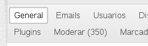
The result should be pretty obvious by now:
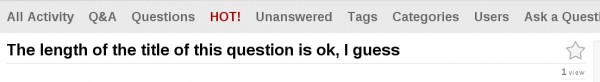
I also noticed a waste of vertical space in the question titles, users, etc which also seem to be unaligned from the favoriting star:


Which can be turned into something like this:

In order to do so modify the same file mentioned above and locate the following CSS classes. Add the green lines and remove the red ones. The grey lines stay the same:
h1 {
color: #444;
font-size: 20px;
font-weight: 700;
margin: 0.5em 0 25px;
margin: 0 0 25px;
font-family: Arial,Helvetica,sans-serif;
font-weight: 700;
line-height: 1.1em;
border-bottom: 1px solid #ddd;
position: relative;
padding: 14px 25px 5px 0;
padding: 0 25px 5px 0;
}
.qa-rss-icon {
/* text-align:right;
float:right; */
position: absolute;
bottom: 0;
right: 4px;
position: relative;
float: right;
top: 4px;
right: 2px;
}
.qa-favoriting {
/* float:right;
margin-right:8px; */
position: absolute;
right: 0;
bottom: 24px;
}
PS1: I'm actually using 1.7 alpha but this should work for 1.6 too.
PS2: I have tested this in Chrome and FireFox (both latest versions)