Welcome to the Question2Answer Q&A. There's also a demo if you just want to try it out.
0 votes
751 views
in Q2A Core by

Since new theme is applied to Q2A so I think it is time to report some issues related to this theme in Q2A QA only.

I have also reported this issue in Github Q2A repo but since Scott would busy with roadmap so maybe someone from here can sought out the problem and create a pull request.

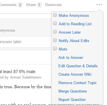
With small image this problem occurs.

Buttons totally miss align. And with increasing features more buttons are coming and without text it is even more difficult for our users. They press button which should be and that creates another headache specially with flag and stuff. Basically so many buttons are making the space crowded.

So wouldn't it be better if a dropdown button style is adopted which is in most websites nowadays. This would hide the less needed buttons and the space would be well used. 

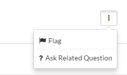
These are two examples how it could be made better.


What do you think about this. 

Q2A version: 1.7.1

2 Answers

0 votes
by

It looks good, but in my opinion it's not good to hide important buttons in one button. Less experienced users will not know that three dot's can lead to more actions.

In my Q2A site i use text next to options button (for example edit, flag... ) so it's clear wich button does what. For example this button  is very confusing so "Hide" text is necessary i think...

by
Basically that makes the complete space filled with buttons which looks very clustered to me. I would certainly like to see only those buttons to be in front which are used the most and those are "Answer", "Comment" buttons. Rest are not used on regular basis so those can be hidden in within a dropdown.
And one of the pics you are watching above is of Quora, Q2A can also learn that when such a big website is hiding buttons to make spacious arrangement then it should also do the same.
To much buttons leave negative impact on users and it also leads to alignment issues in mobile.
0 votes
by
Seems issue is happening due to Image alignment inline css. This can be fixed by clearing float right after content area.

When you said buttons without labels hard to understand than hiding buttons is not a good idea. New user will stuck searching it.

I prefer the way it is just need to clear the float right after content area. I need to check for it.
by
Well the problem is only icons. Users are getting confused with so many icons and with some plugins these buttons increase and those create even more confusion.
So the idea is to write text will all the icons to make it clear to all the users.
The most confusing icons are "Flag" and "Ask Related Question". So it's better if text is written with them.

Now if text is written with every single icon then it would again be problem because there won't be any space left. So for that we suggested dropdown.

Finally you say that users can miss out that dropdown, then I would say that in social networks users operate easily so this won't be any issue with the users. Or atleast give it as an option to hide all the buttons except comment and answer.
...