Welcome to the Question2Answer Q&A. There's also a demo if you just want to try it out.
+12 votes
3.6k views
in Q2A Core by

User pixelngrain has kindly offered to develop a new clean theme for Q2A, which I hope will become part of the core Q2A distribution.

The idea is to have something on a white background which will fit in better with a lot of sites, and a nice professional color scheme.

To help with the process, you are invited to provide input into the design, including  links to sites which you think have the right kind of appearance.

Thanks!


by
Great idea. But please allow easier themeing of the user profile pages in the next version. It is now basically impossible to theme these pages, which for some reason use a table layout. Having good user profile pages is key to making these sites grow. A good example of the way the pages should look is stackoverflow.com
by
@gidgreen,
Have you come up with any conclusion and can start on it or need more time?
by
osseonews is right. There should be "id"s for most elements to be able to style them separately through css.
by
Actually while creating themes I found many things which really needs to change for styling and layout designing. But what I believe changing or adding ID and Class are difficult for now but may be we can ask that for new version. What we can do is finalize one look for the current version and as I believe gidgreen needs more time to adding or modify ID and Class obviously.

7 Answers

0 votes
by
by
That one looks really nice.
by
That looks really nice and some part can be consider in that.
by
Very nice.  I especially like that the vote up/down buttons aren't visible on the question list screen but I'm curious how the single vote button works to both vote up and down.  There is an option to disable the voting buttons on the list screens but it only disables them and they are still visible - I'd rather have them hidden.
0 votes
by
Great idea, one of the most important points would be to have the answer and voting boxes smaller. As well very nice would be some button sets to choose from, similar to DG´s work. A header, as wide as the monitor as well would be fine.

What is really unsatisfiying is to redesign the vote buttons. It would be great to have a much easier way to position them. But there some code needs to be changed as far as I understand to split them up..
by
Can you please post some reference for better idea?
+5 votes
by

Sounds good! If you are interested I did make a "Baseline" theme which is a basic theme with neutral colours, plus a few mods like highlighting selected/no answers in the question list, plus a different vote arrow style.

See screenshots here. It's still a work in progress, but the code is available here on Github. Feel free to use any parts you like. (BTW I have a smaller version of those 'clean' arrows if you like them; I posted it in another question somewhere.)


I think most of my issues with the current setup are more with usability than aesthetics, so I'd like to see things like indication when posts are being sent via AJAX (spinning icon, etc).

+3 votes
by

Design is a question of taste and time.

But true, I nearly did not use q2a because I thought the design is not what I want. Luckily I tried it, and finally saw that q2a is awesome!

Probably it does not need too much changes in the current theme. Just choose a harmonic color theme, and add some css3, e.g. border-radius, box-shadows and gradients.

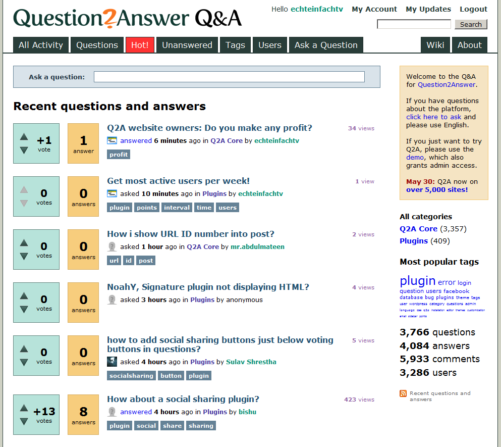
I added the following lines to the current default theme and get a quite accetable result (see screenshot below):

body,td,input,textarea {font:12px Arial,Helvetica,sans-serif; }
.qa-voting {
    box-shadow:0 0 3px #0045ff;
    -webkit-border-radius: 0.5em;
    -moz-border-radius: 0.5em;
    border-radius: 0.5em;
    background: rgb(228,245,252);
    background: -moz-linear-gradient(top, rgba(228,245,252,1) 0%, rgba(191,232,249,1) 50%, rgba(159,216,239,1) 51%, rgba(42,176,237,1) 100%);
    background: -webkit-gradient(linear, left top, left bottom, color-stop(0%,rgba(228,245,252,1)), color-stop(50%,rgba(191,232,249,1)), color-stop(51%,rgba(159,216,239,1)), color-stop(100%,rgba(42,176,237,1)));
    background: -webkit-linear-gradient(top, rgba(228,245,252,1) 0%,rgba(191,232,249,1) 50%,rgba(159,216,239,1) 51%,rgba(42,176,237,1) 100%);
    background: -o-linear-gradient(top, rgba(228,245,252,1) 0%,rgba(191,232,249,1) 50%,rgba(159,216,239,1) 51%,rgba(42,176,237,1) 100%);
    background: -ms-linear-gradient(top, rgba(228,245,252,1) 0%,rgba(191,232,249,1) 50%,rgba(159,216,239,1) 51%,rgba(42,176,237,1) 100%);
    background: linear-gradient(top, rgba(228,245,252,1) 0%,rgba(191,232,249,1) 50%,rgba(159,216,239,1) 51%,rgba(42,176,237,1) 100%);
    filter: progid:DXImageTransform.Microsoft.gradient( startColorstr='#e4f5fc', endColorstr='#2ab0ed',GradientType=0 );
}
.qa-a-count {
    box-shadow:0 0 3px #0045ff;
    -webkit-border-radius: 0.5em;
    -moz-border-radius: 0.5em;
    border-radius: 0.5em;
    background: rgb(254,252,234);
    background: -moz-linear-gradient(top,  rgba(254,252,234,1) 0%, rgba(241,218,54,1) 100%);
    background: -webkit-gradient(linear, left top, left bottom, color-stop(0%,rgba(254,252,234,1)), color-stop(100%,rgba(241,218,54,1)));
    background: -webkit-linear-gradient(top,  rgba(254,252,234,1) 0%,rgba(241,218,54,1) 100%);
    background: -o-linear-gradient(top,  rgba(254,252,234,1) 0%,rgba(241,218,54,1) 100%);
    background: -ms-linear-gradient(top,  rgba(254,252,234,1) 0%,rgba(241,218,54,1) 100%);
    background: linear-gradient(top,  rgba(254,252,234,1) 0%,rgba(241,218,54,1) 100%);
    filter: progid:DXImageTransform.Microsoft.gradient( startColorstr='#fefcea', endColorstr='#f1da36',GradientType=0 );
}
.qa-q-list-item {
    background:#FFFFCC;
    padding:10px;
    -webkit-border-radius:.5em;-moz-border-radius:.5em;border-radius:.5em;
    border:1px solid #DFDFDF;
    box-shadow:0 0 3px #CCCCFF;
}
.qa-tag-link {
    font-family:Tahoma;
    font-weight:normal;
    color:#565656 !important;
    background: rgb(254,255,232);
    background: -moz-linear-gradient(top,  rgba(254,255,232,1) 0%, rgba(214,219,191,1) 100%);
    background: -webkit-gradient(linear, left top, left bottom, color-stop(0%,rgba(254,255,232,1)), color-stop(100%,rgba(214,219,191,1)));
    background: -webkit-linear-gradient(top,  rgba(254,255,232,1) 0%,rgba(214,219,191,1) 100%);
    background: -o-linear-gradient(top,  rgba(254,255,232,1) 0%,rgba(214,219,191,1) 100%);
    background: -ms-linear-gradient(top,  rgba(254,255,232,1) 0%,rgba(214,219,191,1) 100%);
    background: linear-gradient(top,  rgba(254,255,232,1) 0%,rgba(214,219,191,1) 100%);
    filter: progid:DXImageTransform.Microsoft.gradient( startColorstr='#feffe8', endColorstr='#d6dbbf',GradientType=0 );
}


screenshot_new_css_q2a

Click here to see the full image!
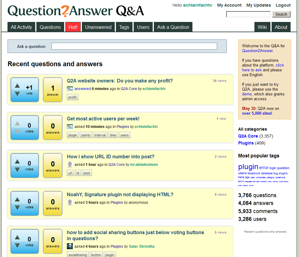
before (saved for the sake of memory wink ):

–1 vote
by

Here are some samples for inspirations:

+2 votes
by
I'm going to go out on a limb here and say that I think there could be more thinking outside of the box on this topic.

Stack Overflow established what people think a Q&A site should be all about, but the developer world has certain characteristics that are different from other circles and I question whether many of the things on Stack Exchange are appropriate or optimal for those other circles.

For example, I think the whole voting and badges system can work both in good and bad ways, the bad way being the facilitation of negativity on a site. Personally I like Tumblr's philosophy of keeping things positive.

I also think there are perhaps too many bells and whistles for the average person, who wants simplicity and ease of use. Developers have a much higher capability for this kind of complexity than the average user has.

I'm workiing on a site now that will be greatly simplified and will share it at the appropriate time. But I just wanted to first mention the direction I'm going because I think a lot of people are trapped by the box of what currently exists and could probably benefit from re-thinking entirely what a Q&A site should be.
+1 vote
by
I think undue emphasis is being given to votes, while commentsis treated as if they are not part of a discussion. Personally, I don't care very much about votes or views, so a theme should give prominence to answers and comments.

A comment should be treated just like an aswer as it sheds some slight to the question.

Another thing is the width of the sidebar. It should be wide enough to hold at least a 300x200 banner.
by
"A theme should give prominence to answers and comments"

I couldn't agree more!
...