As the times move on, I think it's also time for a better, modern Logo design for Question2Answer.
I believe that with a fresh new logo design, this will inspire developers and enthusiasts to create more. Maybe even come up with a whole new theme design to fit the new logo.
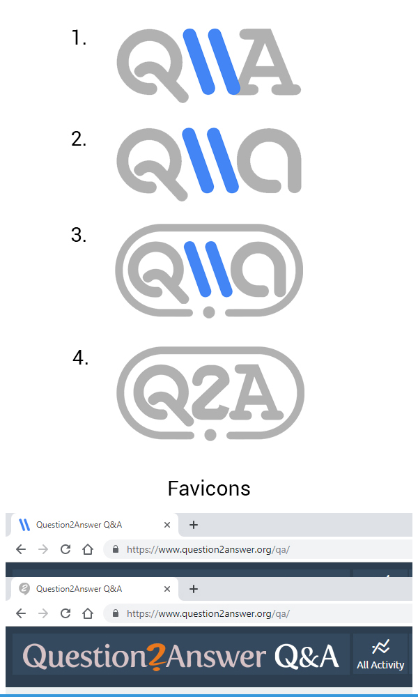
I've been brainstorming over night and here's a few ideas I've come up with.
These logo ideas were created mostly with round and symmetrical shapes to represent harmony, and with the color blue to symbolize wisdom, confidence and intelligence. Which is what Questions and Answers is all about. The blue color can be changed afterwords, with the native orange if preferred, to keep the roots.
If any of these looks interesting, feel free to leave a comment below, or take some ideas to create a better version.
It would be cool if anybody with logo design skills also join this post and share your version with us.
We could vote for one we like most, and at the end work it out to make it official.